Personal.
Below are sites I’ve created whilst learning the craft of web design and development.
I've been creating websites since 1996 when I was just a kid. I started out by learning HTML and CSS, and then I moved on to more complex programming languages like PHP and JavaScript. I've created well over 100 websites over the years, for companies both big and small.
I love the challenge of coming up with a creative and effective website design, and I'm always looking for new ways to improve my skills. I'm passionate about web design, and I'm excited to see what the future holds for this ever-changing industry.
Paul’s Home Page
This was the first-ever Web site that I'd created. It was not that bad for my first attempt at HTML.
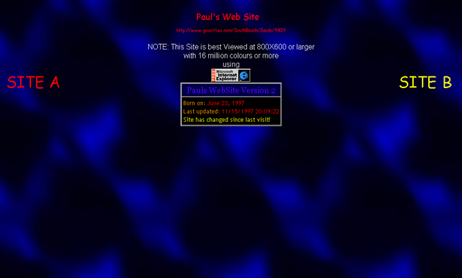
Paul’s Web Site
My second home page provided a Frames and a Non-frames version of my content. This was because at the time some browsers didn't full support Frames.
Paul’s Web Site
The third version of my home page used frames.
It featured an image map for the navigation bar down the left-hand side.
This was my first experience of using image maps (which was done by hand-coding, and getting the co-ordinates correct was a nightmare)
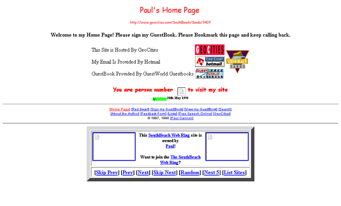
Paul’s Home Page
Hosting my website at GeoCities meant that I could be involved in the community of other sites, so joined a web ring. This site featured another design which I was very good at the time.
Paul’s Home Page
A variation on my previous site but I added a Frames version. A background image was also added.
Paul’s Home Page
This site was the fifth redesign of my homepage. This used an image map as the main navigation. I used FrontPage 98 to find the image map coordinates and used Notepad to write the rest of the site.
I was not impressed enough with this redesign, so this site was never available online.
Paul’s Home Page
Created as a filler for my web space over the Christmas of 1997. I was updating my website and thought that it might be nice to have this site on my webspace during this time. This was just a single page with a festive message.
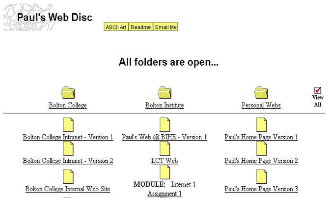
Paul's Web Disc
This site was a visual front-end to all the websites I'd created at the time, which I'd burnt to CD. The CD was a portfolio of my websites.
Paul’s Home Page
I again redesigned my homepage when and tried to use images, for navigation, in the way I wanted. I was quite pleased with this as it worked.
Paul’s Home Page
The only reason for this redesign was that I wanted to use the 'ring-binder' background image. No further explanation is needed. :)
Paul’s Home Page
GeoCities, my host created a new corporate Logo (a fancy 'g'). So I redesigned my site once again, to incorporate this logo into my site.
I took this site down soon after, as it took too long to download (even on a T1 connection).
Paul’s Home Page
After I found my previous website to download very slowly. I created this site using a table but giving the impression that it might use frames. Using very few images, I used an image from the background, but text links for navigation.
Paul’s Home Page @ GeoCities
A very slight modification to the previous site. An awards page was added, and a web statistics button was added also.
Paul Gannon Online
When I bought my first-ever domain name (www.paulgannon.co.uk), I wanted to create a site bearing the URL on the page. I used a Flash banner at the top for navigation. This was my first use of this technology, and wasn't very good actually :(
Paul Gannon Online
I wasn't happy with my first site design for my new domain, so I decided to come up with something new. I think I did two versions of this same design.
Paul Gannon Online
I had just downloaded the 30-day trial of Macromedia Dreamweaver 4 and was impressed with the Flash-button feature which had been added and so I redesigned my site based on the navigation.
Paul Gannon Online
I felt my site needed some life and so created this site using a funny caricature of myself on the home page.
Paul Gannon Online
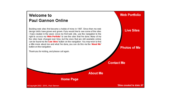
This is the site you're currently viewing. I thought that updating 60+ pages every time I wanted to update my personal site was going to be a pain; so I put the information from my Web Portfolio into a database, allowing me to separate content from design and make it a lot easier to manage.
Park United - Millennium Reunion
A friend asked if I could create a single web page for an event he was organising. This page was the result. He was very impressed and pleased with it.
TOTAL RED DWARF
Being a fan of Red Dwarf, I've had a Red Dwarf section on my home page since my very first one. My Red Dwarf sections almost always had a black or starry background. Therefore I decided to separate it from my main site and create a Red Dwarf 'Only' site. This site was to become my favourite past-time.
TOTAL RED DWARF
TOTAL; RED DWARF (TRD) was my favourite site. I worked on this site constantly for many years. This is a huge site. The site was online for many years and was very well known in the Red Dwarf Fandom.
It used to be at the domain totalreddwarf.co.uk
Paul Gannon Online
.
Paul Gannon Online 2003
.
Paul Gannon Online
.
Paul Gannon Online
.
Paul Gannon Online
.
Paul Gannon Online
.
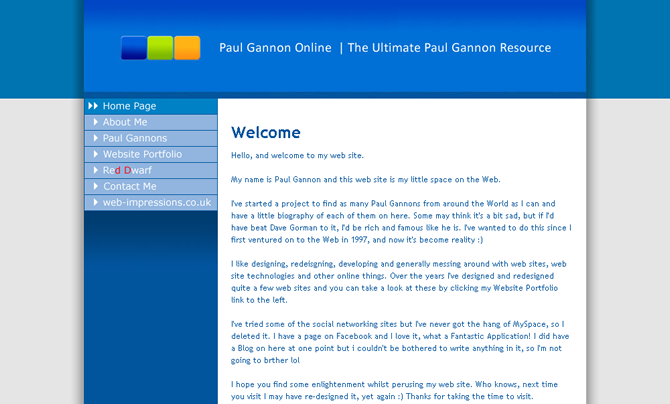
Paul Gannon Online | The Ultimate Paul Gannon Resource
.
Paul Gannon Online 2010
.
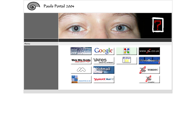
Pauls Portal 2004
.
RUN CD
Back in 1996 when I started with web design I found that you could open local drives from a web page and created a website to do so.
Laser Quest
.
Zen’s Homepage
.
Video Selector
Back in 1996 we only had HTML 4.2 and different browsers had different features. I built this page for Internet Explorer. Clicking the numbers changed the IFRAME in the centre to a page with a different video.


